 |
 |
Customer Services |
For customer service questions, and private queries, you can email us from the "Contact Us" page.
Product Support |
We encourage you to post your support queries on our User Forum. This means that LimeLIGHT users can read and learn from answers to each others' questions. The Trace Lighting staff are regularly on hand in the forum to provide answers.
Joining the Trace Lighting User Forum is free, and takes just a few seconds.
Fixture Editing |
Fixture Editing
Making fixtures is relatively straight forward, especially for people who already have some understanding of XML or even HTML. In order as to create or edit fixtures you will need a program capable of editing XML. I prefer MS XML notepad, however Sublime text is also very good and available for all operating systems. Many other XML editors are available, however those are the two I prefer for making fixtures. LimeLIGHT's fixture editor is, as it has been for sometime, awaiting improvement though it can also be of assistance particularly for embedding fixture images.It is suggested that as a first step you identify a similar fixture to the one you wish to create: other fixtures by the same manufacturer are often a good starting point, particularly if there is a more fully featured version of the same fixture available. If another fixture by the same manufacture is available then it is often possible simply to delete unwanted features and slightly renumber the channels. Where this is not possible, if the fixture appears to be a generic copy of a well known fixture, sometimes the well known fixture is a good starting point, or alternatively some generic fixtures are available under from many manufacturers, often keeping the same channel layout. As a last resort simply take a fixture of the same general type (moving head \ laser \ LED wash light) and modify that.
Click on the + to expand a section. Alteratively, to expand everything.
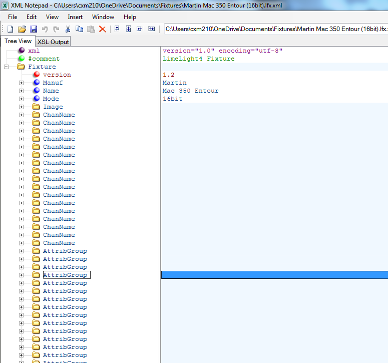
At the highest level fixture files contain the information used to identify the fixture - Manufacture, Model and an Image, followed by a list of channels and "Attribute Groups". Taking each of these in turn:
- Manufacture, Model, Mode These are used to identify the fixture in the Fixture Manager Screen. Note that if you spell or capitalise the Manufacture differently then it will appear as a new group.
- Image For best results, use a 100px X 100Px image on a transparent background. You can either reuse an existing image, link to an image in the "Images" subdirectory under fixtures, or embed one using this tool. If you choose to embed the image, the tag it creates needs to go at the highest level of the file, after all the attribute groups.
- Channel ListThis is a simple list of channels the fixture uses. It used to display the correct channel on the output window, and to reserve the correct number of channels. Note that here, as with the rest of the fixture file channel numbers start from 0 i.e. the first channel of the fixture is 0, not 1!Generally fixture manuals start there numbering from one, so you will need to subtract one from the channel number in the manual. See example below:
<ChanName id="6">Rotation</ChanName> Note the channel is supplied as an attribute, entitled id and the value is the element's value.Fine Channels
It is here that you specify any fine adjustment channels a fixture has: if (as is the most common example) it uses 16 bits for pan and tilt i.e. it has both pan and "pan fine" or "pan adjust" this is where you specify it. For example:
<ChanName id="0" fine="1">Pan</ChanName>
<ChanName id="1">Pan Fine</ChanName> Note that whilst in the example the fine channel is directly after the course channel that is not compulsary: many fixtures are laid out "pan,tilt, pan fine, tilt fine" for example, just add this in the same way. Note that if you use a fine channel then attributes are treated within LimeLIGHT as 16 bit, so the highest possible value is 65535, not 255. Simply copy an existing 16 bit channel rather than remembering the number! - Attribute Groups This is where the bulk of the functionality, including the controls displayed to the user are defined. Further details below.
Attribute groups are used to group together related attributes on the same channel, for example all shutter operations can be held together in one group. Note that it is imperative that only attributes on the same channel are grouped together, otherwise the fixture will not function.
As can be seen from the above example the name of screen on which the fixture attributes are to appear is included as an XML attribute possible values are:
| Code | Screen | Generally used for |
|---|---|---|
| int | Intensity | Brightness related attributes such as; shutter, dimmer strobe |
| col | Colour | Colour wheels, RGB and Colour Macros |
| gob | Gobo | Gobo's |
| beam | Beam | Beam shaping, shutters, also zoom,focus, and prism |
| mov | Movement | Movement (pan, tilt etc...). Movement speed is often also located here |
| other | Other | Anything which doesn't fall into any of the other categories; special features etc. |
| rst | Reset | A special screen only for resetting the fixture |
This is a simple piece of fixture functionally that can be represented with a single control, such as a slider or button. These are grouped together by the attribute groups above, as the name would suggest.
<Channel>0</Channel>
<Def>0</Def>
<Locate>255</Locate>
<Fadeable/>
<Generic/>
<Slider>
<ORng min="0" max="255"/>
</Slider>
</Attrib>
The above example is a very common intensity channel. This was selected as an example as it contains all of the common options, as detailed in the table below.
| Attribute | Purpose | Notes |
|---|---|---|
| Name | The internal name of the attribute | If you use the same naming convention as other fixtures, then when you select multiple fixtures and change a value (for example brightness) LimeLIGHT will know to change that value on all fixtures. int_int as shown in the example is the standard name for a brightness channel. A LimeLIGHT's common attribute names are available Here, for any you can't find, looking in fixture files similar to the one you are creating may help, otherwise, create new names following the pattern on the attribute names page. |
| Channel | The zero based DMX channel | The example channel here would be the fixture's first channel i.e. it's DMX address |
| Def | Default | Value the attribute should output until commanded otherwise. This must always be specified by one of the attributes on every channel, even if it is 0. |
| Locate | Locate | The value to set this attribute to when the user presses locate. This should remove all effects from the beam path and leave the fixture in the middle of it's pan and tilt range, with the light on and white. If this attribute will not be used locating the fixture you do not need to supply a value. |
| Fadeable | Determines whether this attribute should fade when fading between cues. | This is generally so long as the attribute is not just a number of discreet steps |
| Generic | The dimmer attribute | Channels marked this way are affected by the Grand Master fader and appear on the fixture intensities window. With the exception of fixtures with multiple light sources (e.g. sunstrips) this should be set only once per fixture. |
Whilst it is technically possible to create an attribute with no controls, it is normal to include some controls, so as to make the attribute usable. The above example has the simplest possible arrangement: a single slider for the channels complete range.
Layout
The way the controls are displayed on the screen is governed by the values of the following attributes, which can be applied to any control of any type:- rowstart If set to true, this causes LimeLIGHT's layout manager to start a new row of controls. If not specified, rowstart is assumed to be false.
- width This forces a control to be a particular width. If not set LimeLIGHT will automatically determine the best possible width for a control. If you wish to specify the width of a control, use a fraction of the overall row width e.g. 1/5. This is commonly used to make a small "No Strobe" button before the start of a strobe fader for example. When starting out developing fixtures it is not recommended that you use this property: normally, with use of the rowstart attribute it is possible to make LimeLIGHT lay the controls out reasonably sensibly.
Possible Controls
The following controls are available, click one of the below to jump directly to the control, otherwise just read through the guide in order (controls are listed in order of their utility and complexity).Slider

The simplest control of all, a slider lets you choose any value within a range you specify, for example the slider above is created using the following code:
<Slider rowstart="True"><Name>Intensity</Name><ORng min="0" max="255" /></Slider>
This assigns the entire range of a channel to one slider, appropriate when it is the only function on a given channel. Note also that this slider has rowstart set to true, ensuring it is the first item on a row. If no other controls are added to the attribute, and no other attributes to the attribute group, the slider will have a row to itself.
Buttons
These are used when you need to output discreet values, such as shutter open \ closed. It is common to put multiple buttons on a line, however think about the length of the text if you are including many buttons on one line.<Channel>9</Channel>
<Def>0</Def>
<Locate>32</Locate>
<Button>
<ORng min="0" max="31" />
<Enum>0</Enum>
</Button>
<Button>
<ORng min="32" max="63" />
<ORng min="132" max="139" />
<ORng min="182" max="189" />
<ORng min="232" max="239" />
<ORng min="248" max="255" />
<Enum>1</Enum>
</Button>
</Attrib>
- As well as the child members discussed above buttons also have a child called "Enum". This should be set to a value between 0 and 1, with a different value for each button within an attribute. Where an attribute contains a mixture of buttons and other controls setting this value will cause an error!Where an attribute contains only buttons, it is compulsory to set this value.
- Buttons can have an unlimited number of output ranges. They will always use the first specified, but in the (unlikely) event that you use LimeLIGHT with a DMX input defining the others will insure the correct button is highlighted for any given input
Slider - 3 way

This is commonly used for things which can rotate in either direction, or stop. Gobos, Gobo and Colour wheels and common usages, alongside side prisms. As is visible in the image above, the control gives forward, back and stop symbols, along with a fader, normally used for speed.
<ORng dir="F" min="128" max="189" />
<ORng dir="S" min="190" max="193" />
<ORng dir="R" min="194" max="255" />
</Slider3way>
As you can see from the above example code, it is very similar in definition to a normal slider, expect that each ORng has an extra attribute: dir which can take one of three values: F,S and R. To use a Slider 3 way all must be specified. If no stop value is needed you can use a slider 2 way - see below.
Slider - 2 way
A two way slider is exactly as with the slider three way above but with no "stop" button or range. <Slider2way rowstart="True">Special Controls
LimeLIGHT makes available a number of special controls intended for particular attributes.Position Panel
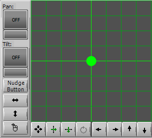
This control, denoted PosPanel, is used which any fixture that moves, be they moving heads, scanners or even (if desired) laser's. Of all the special controls it's the most common - one appears in almost every fixture. This is also the most common place to encounter 16 bit attributes, that is attributes with a fine channel, the values shown in the example below are correct for that scenario.
<Channel>10</Channel>
<Def>32767</Def>
<Locate>32767</Locate>
<Fadeable />
<PosPanel id="0" axis="X">
</Attrib>
</AttribGroup>
The code above sets out the X or pan movement from a typical 16 Bit control channel, in this case a Mac 350.
This controls differs from the simpler sliders and buttons in that it affects multiple attributes, spread across multiple attributegroups.
You will note from the example above that PosPanel takes two attributes not required on other controls:
- id This is used to uniquely identify the position panel if more than one is present in the fixture file. Use 0 for the first, 1 for the second etc. It is uncommon to need multiple position panels in a fixture definition, but there are some very unusual fixtures available!
- axis The movement axis, X or Y.
The example below is a complete Position Panel for a 16 Bit fixture, including both X and Y movement. Note that since X and Y are on different channels, they must also be in different attribute groups.
<Channel>17</Channel>
<Channel fine="1">18</Channel>
<Def>32767</Def>
<Locate>32767</Locate>
<Fadeable/>
<PosPanel id="0" axis="X">
</PosPanel>
</Attrib>
</AttribGroup>
<AttribGroup frm="mov">
<Channel>19</Channel>
<Channel fine="1">20</Channel>
<Def>32767</Def>
<Locate>32767</Locate>
<Fadeable/>
<PosPanel id="0" axis="Y">
</PosPanel>
</Attrib>
</AttribGroup>
Colour Mixer
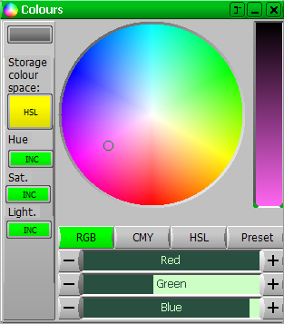
Like the position panel above, this control affects multiple attributes spread across multiple channels. It is possible to use multiple colour pickers in one fixture definition, however this can start to fill the available screen space very quickly.
</ColMixer>
| Axis | Identifier | Colour Space |
|---|---|---|
| Red | R | RGB |
| Green | G | RGB |
| Blue | B | RGB |
| Cyan | C | CYM |
| Magenta | Y | CYM |
| Yellow | M | CYM |
| Hue | H | HSL |
| Saturation | S | HSL |
| Luminescence | L | HSL |
<Channel>0</Channel>
<Def>255</Def>
<Locate>255</Locate>
<ColMixer id="0" axis="R">
<AttribGroup frm="col">
<Channel>1</Channel>
<Def>255</Def>
<Locate>255</Locate>
<ColMixer id="0" axis="G">
<AttribGroup frm="col">
<Channel>2</Channel>
<Def>255</Def>
<Locate>255</Locate>
<ColMixer id="0" axis="B">
Colour Palettes
Colour pallets are used with fixtures that have a colour wheel (such as discharge moving heads, or scrollers) and with pre-set colours in fixtures capable of emitting any colour. In the example image below a complete (but simple) colour form is shown, with both a colour palette for choosing the colour and a two way slider for continuous scroll, since that the fixture this is taken from (a Chauvet Intimidator 450) offers that functionality.
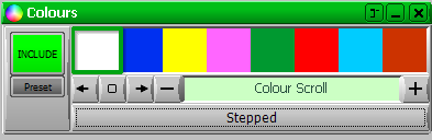
Unlike Colour Mixers and Position Panels these are contained within one attribute, often with further attributes controlling things like continuous control scroll. The XML that generated the example image is shown below:
<DisplayName>Colour 1</DisplayName>
<Channel>5</Channel>
<Def>0</Def>
<Locate>0</Locate>
<Fadeable/>
<Palette type="snap">
<ORng min="0" max="64"/>
<Col type="rgb" name="FFFFFF" min="0" max="7"/>
<Col type="rgb" name="0030F0" min="8" max="15"/>
<Col type="rgb" name="FFFF00" min="16" max="23"/>
<Col type="rgb" name="FF66FF" min="24" max="31"/>
<Col type="rgb" name="009930" min="32" max="39"/>
<Col type="rgb" name="FF0000" min="40" max="47"/>
<Col type="rgb" name="00CCFF" min="48" max="55"/>
<Col type="rgb" name="CC3300" min="56" max="63"/>
</Palette>
<Palette type="scroll">
<ORng min="65" max="127"/>
<Col type="rgb" name="FFFFFF" val="65"/>
<Col type="rgb" name="0030F0" val="78"/>
<Col type="rgb" name="FFFF00" val="86"/>
<Col type="rgb" name="FF66FF" val="92"/>
<Col type="rgb" name="009930" val="107"/>
<Col type="rgb" name="FF0000" val="136"/>
<Col type="rgb" name="00CCFF" val="152"/>
<Col type="rgb" name="FF7F00" val="170"/>
</Palette>
</Attrib>
<Attrib>
<DisplayName>Colour 1 Scroll</DisplayName>
<Channel>5</Channel>
<Fadeable/>
<Slider2way rowstart="True">
<ORng dir="R" min="171" max="212"/>
<ORng dir="F" min="213" max="255"/>
</Slider2way>
<PalTypeButton rowstart="True"/>
</Attrib>
</AttribGroup>
The example above is a complete AttribGroup, with two attributes: one for scroll and another with the colour palette, the PalTypeButton switches between the two available palettes; one of which offers split colours, the other snaps. The names of the palettes, to display on the PalTypeButton are set by the "name" element within the palette. The type attribute of the palette determines whether LimeLIGHT allows the user to scroll the palette or limits selections to entire colours.
The individual items in the pallet are defined by the col elements such as: <Col type="rgb" name="FFFFFF" min="0" max="7"/> or <Col type="rgb" name="00CCFF" val="152"/>. The colour definitions have the following attributes:
- type When making your own fixtures it is easiest always to use rgb here, however where the colour is in the LimeLIGHT colour database you will also see "Lee" or "Martin", for predefined colours.
- name The RGB value, of the colour, in hexadecimal. This is the same system as web colours, but without the "#" at the start for example FF0000 is a very saturated red. There are many online colour pickers available, this from w3schools is reasonable, but many others are available. Offline colour pickers are also available.
- min,max This is for colour pallets which snap, the minimum and maximum value which will cause a colour to be output. Use with snap palettes.
- val This is for palettes which allow split colours and is the value for which only the colour specified is output. Use with scroll palettes. Note that is is imperative that only the correct means of specifying the output value is used, otherwise the palette will not work.
Gobo Palettes
Gobo palettes are very similar to the colour palettes set out above, so I will only describe the differences here. The key difference is that gobo palettes display images rather than blocks of colour to improve gobo selection. If this too time consuming to implement it is of course entirely possible to just use a slider for the gobo channel.
<ORng min="0" max="63"/>
<Gobo src="Short" file="open.jpg" name="Open" min="0" max="7"/>
<Gobo src="Embed" file="1.png" name="Dots" min="8" max="15"/>
<Gobo src="Embed" file="2.png" name="Bars" min="16" max="23"/>
<Gobo src="Embed" file="3.png" name="Dotted Circles" min="24" max="31"/>
<Gobo src="Embed" file="4.png" name="three way" min="32" max="39"/>
<Gobo src="Embed" file="5.png" name="Six way" min="40" max="47"/>
<Gobo src="Embed" file="6.png" name="Star" min="48" max="55"/>
<Gobo src="Embed" file="7.png" name="Pink Circles" min="56" max="63"/>
</Palette>
- src The possible values for this are:
- Long
- Short
- Embed
- fileThe name of the file holding the image. In the case of case of embedded images the file name is embedded along with the data and is the same name used when the file was sorted separately.
- name in this case acts as display text describing the image.
All this is quite complex and I've doubtless made omitted some vital information, feel free to get in touch via the forum or contact form above if you have any difficulties. I wish you every success creating your own fixtures!
It might also help you to see all the fixtures we currently hold: not all are included with the current LimeLIGHT installer, in some cases because they were single purpose fixtures unlikely to be deployed anywhere else.
 |
Terms of Sale | Privacy Policy | Contact Details Copyright 2026 Trace Lighting Ltd. All rights reserved. |